Chart Types
Charts represent the price data fluctuations caused by varying market forces. The information found in these charts enables a chartist skilled in the science of technical analysis to draw trading signals for future price activity. The primary chart types used for the analysis of the Forex market are:
The most popular type of chart in use today is the candlestick chart. Originally developed in Japan, it did not come into popular use until the 1980s. The line chart is the original type of chart and is still in wide use today, primarily due to its convenience and effectiveness in plotting price data over extremely long and short periods of time. The bar chart is also used by many traders. Although any one of these chart types can be used equally well for most analytical techniques, most traders develop certain preferences for use in their analysis.
Line Chart
In order to plot a line chart, single prices for a selected time period are connected by a line. The most popular variation of the line chart is the daily line chart, which plots each day's closing price. The basic problem with the daily line chart is its lack of data on intraday market activity. This issue has been amended in recent years with the use of computer power to plot line charts with smaller increments. Whereas other chart forms may fall behind in the accurate reporting of price data over very small intervals, the line chart can be used to plot data for intervals as short as 5 seconds or even a single tick. Line charts are also extremely useful for obtaining a “big picture” view of market trends over several years. The only remaining flaw with the line chart is its lack of ability in reporting price gaps, as these cannot be represented on a continuous chart.
Bar Chart
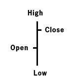
Any given line in the bar chart consists of four important points.
- High - The top point of the vertical bar
- Low - The bottom point of the vertical bar
- Opening Price - A small horizontal line to the left of the vertical bar
- Closing Price - A small horizontal line to the right of the vertical bar
The bar chart’s advantages are its ability to display the price range over the selected period as well as its capacity to plot price gaps. One of the bar charts major disadvantages however is its inability to plot the whole price fluctuation, even when plotted for extremely small periods of time.
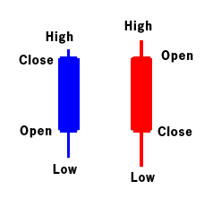
Candlestick Chart
Technical Analysis Figure 2 The candlestick chart is quite similar to the bar chart as it also consists of the same four primary price points: the high, the low, the open and the close. The candlestick is often considered easier to view and thus analyze than its bar and line chart contemporaries
Last Modified: 2009/10/27 04:43:08


 Registrarse con correo electrónico